The
Kraftora
Story
Kraftora was founded on the belief that exceptional furniture is not merely functional - it is the quiet architecture of how we live. Each piece is designed to endure across generations, carrying the warmth of natural materials and the precision of thoughtful craftsmanship.
Drawing from Scandinavian restraint, Japanese simplicity, and Italian structural elegance, Kraftora speaks a universal design language - recognized from Milan to Tokyo, Copenhagen to Dubai.
"To create furniture that honors the intelligence of natural materials and serves the demands of contemporary life - with precision, warmth, and enduring beauty."
To be the world's most trusted premium furniture brand - present in the finest homes, offices, and hospitality spaces across every continent.
Designed for living.
Built to last.
Elevated spaces.
Six values that define
everything we make
Every joint, finish, and surface reflects the mastery of skilled hands and time-honored technique.
Progressive thinking meets timeless form - always questioning convention to find better solutions.
Furniture made to outlast trends, seasons, and decades - materials selected for a lifetime of use.
Form follows feeling - ergonomics and sensory experience are inseparable from visual beauty.
Responsible sourcing, minimal waste, and designs made to endure - not to be replaced.
Millimeter tolerances. Consistent grain direction. Perfect proportions. The details that cannot be unseen.
The Kraftora
Mark
A precisely constructed geometric K. The vertical bar represents structural integrity. The two diagonal arms - separated by a deliberate 4-point gap - reference the precision joinery of fine furniture. Together, the negative space echoes a well-crafted chair viewed in profile.
Maintain minimum clear space of ½ the mark height (x/2) on all four sides. Never place competing visual elements within this zone.
A palette drawn
directly from nature
Each color references a material - walnut wood, polished stone, brushed brass hardware, aged leather, forest canopy. The palette communicates warmth and premium quality without artifice.
CMYK 0, 43, 67, 76
CMYK 0, 14, 24, 84
CMYK 0, 2, 6, 5
Garamond
Styles: Roman + Italic
Usage: Headlines, pull quotes, luxury packaging, editoral text
Usage: Body text, UI components, navigation, labels, specs
+49 30 1234 5678
kraftora.com
20121 Milan, Italy
kraftora.com
Natural Oil Finish
kraftora.com · Milan · Copenhagen · Dubai
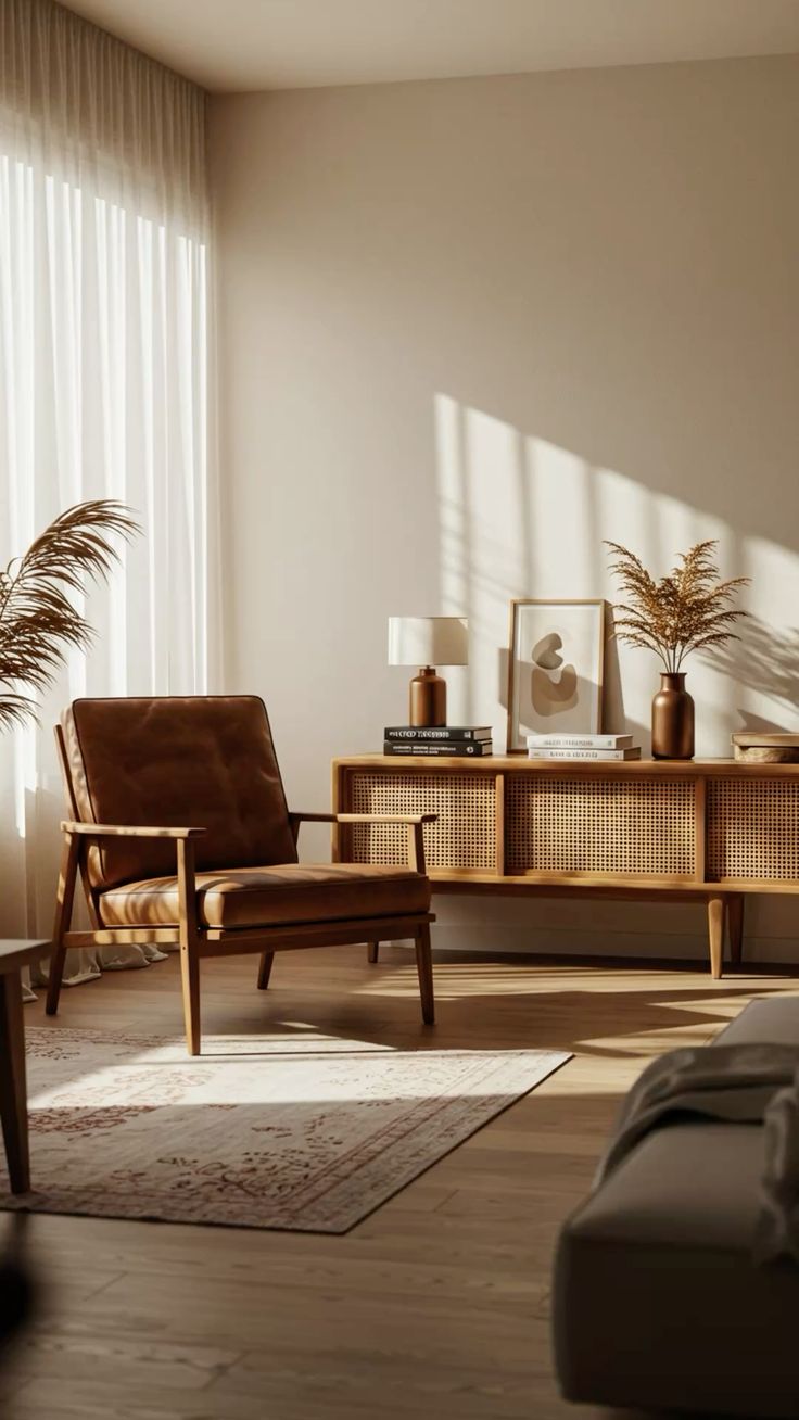
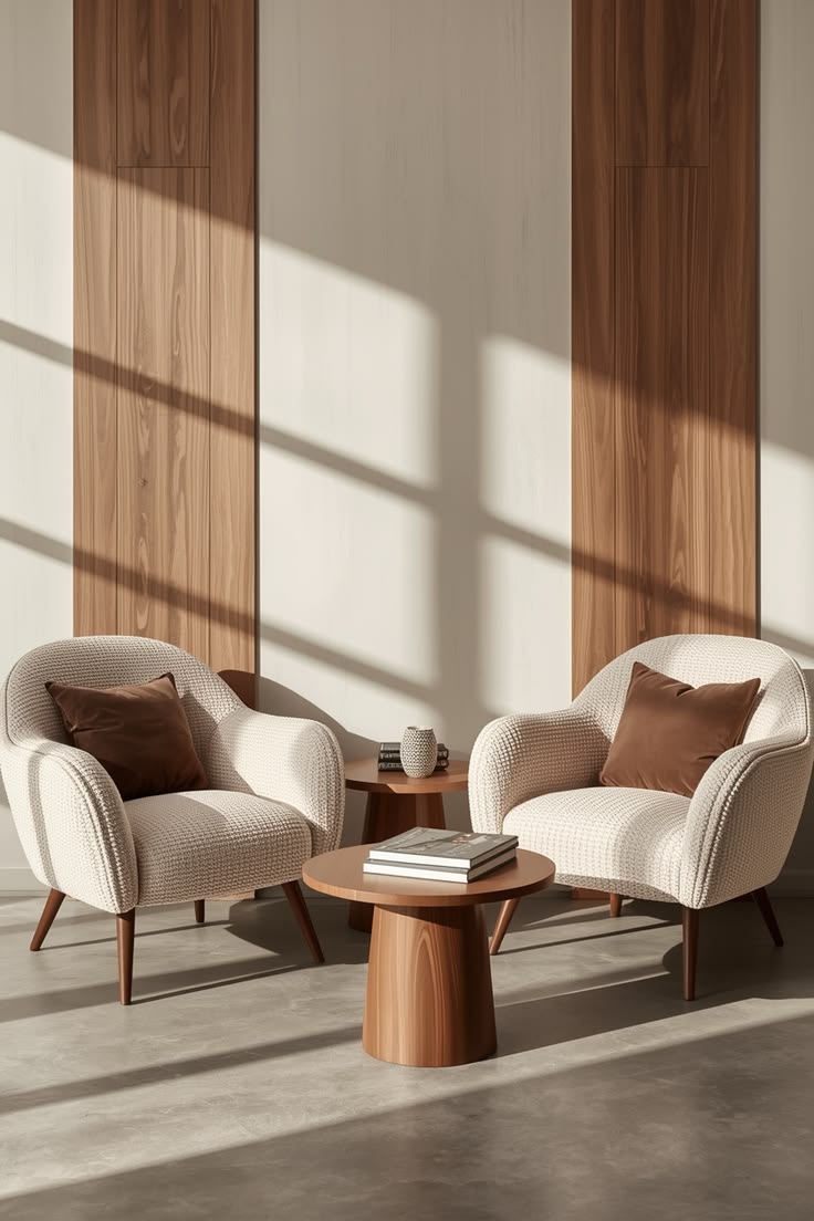
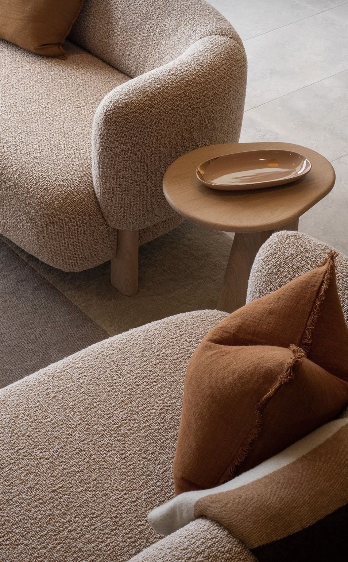
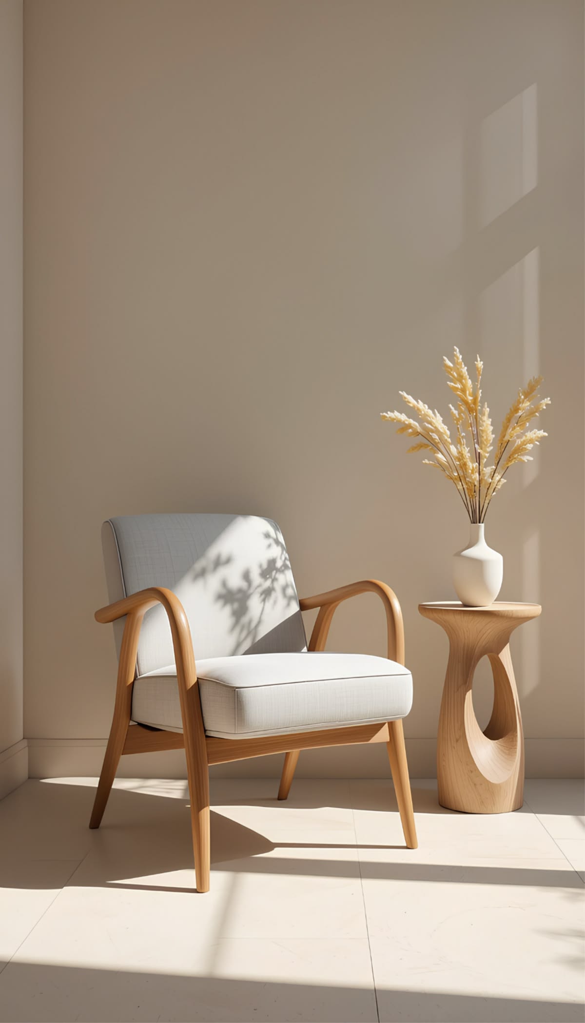
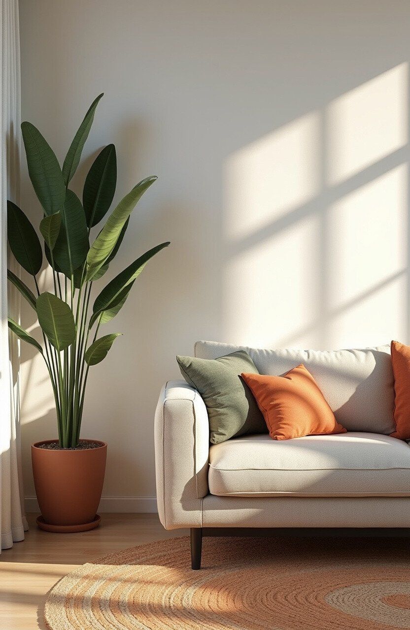
Light. Texture.
Authenticity.
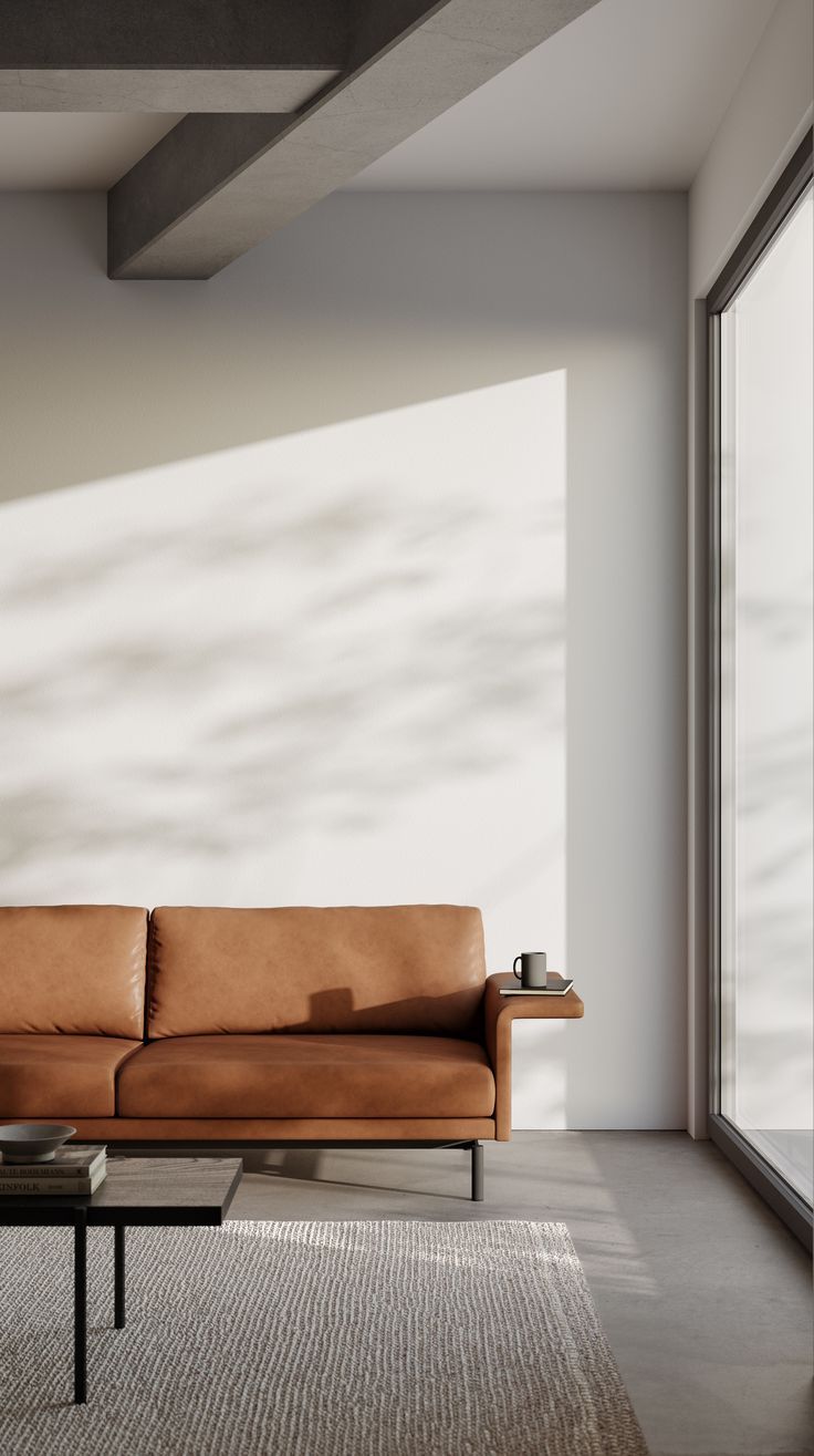
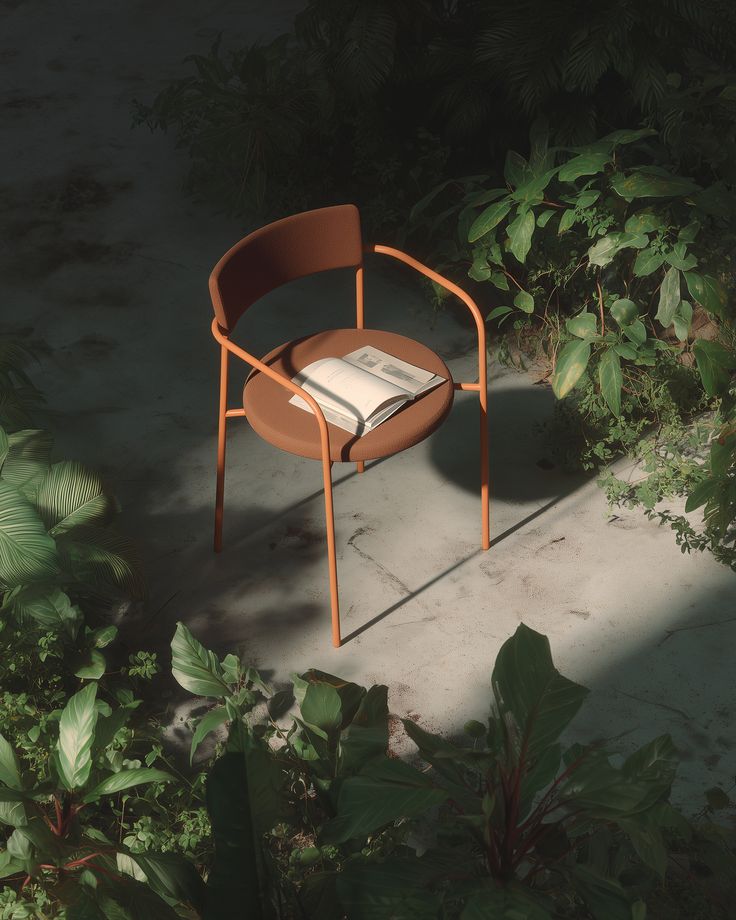
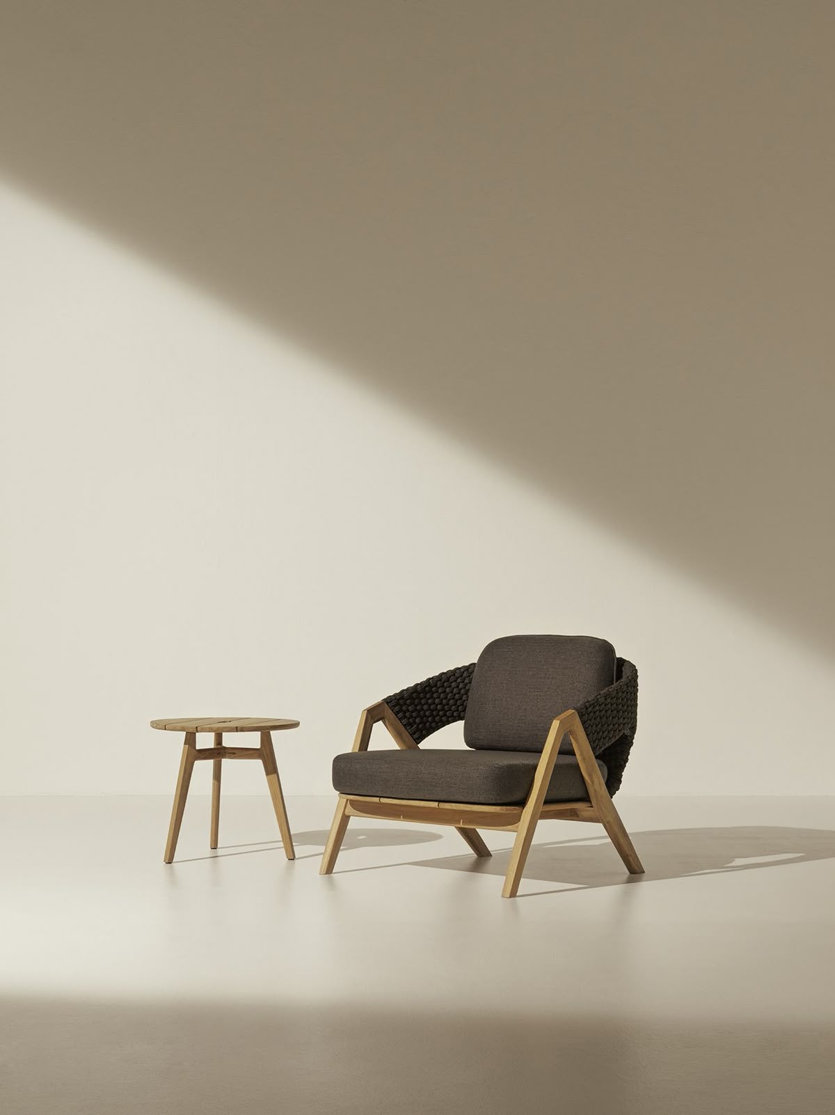
Natural daylight, single source. Soft directional shadows revealing material texture. No flash.
Neutral, uncluttered spaces. Warm natural tones - wood floors, stone walls, textured plaster.
Architectural perspectives. Generous negative space. Close-up craft details. Editorial framing.
Warm tones, restrained contrast. Preserve natural wood color. Never oversaturate. Subtle grain.
We speak with
precision and warmth
Statements over claims. We know our craft. Never boastful, never apologetic.
Personal without being familiar. Human without being casual. We make spaces liveable.
Every word earns its place. Say less, mean more. White space extends to language.
Sophisticated vocabulary without jargon. Educated without being academic.
"The Oslo Chair - American black walnut, hand-rubbed oil finish. Designed to be used every day for the rest of your life."
"Experience the luxury of our amazing premium quality furniture that will transform your living space!"
"Some things improve with age.
Your furniture should be one of them."
"We don't make furniture. We make the backdrop to a life well-lived."
Always work within the eight defined brand colors. Consistency across touchpoints builds recognition.
Allow design and photography to breathe. Premium is defined by what we don't say as much as what we do.
The serif carries editorial weight; the sans handles body and UI. Never swap their roles.
Warm, directional daylight that reveals material texture and form is the Kraftora standard.
Never recreate or redraw the mark from memory. Every application starts with the master file.
These cheapen the visual identity and contradict the architectural precision of the brand.
Filling every inch signals mass-market positioning. More space equals more premium.
Only Cormorant Garamond and DM Sans. Any addition requires brand director approval.
Kraftora is timeless. Avoid distressed textures, retro filters, and decorative overload.
Always ensure sufficient contrast. Use a solid color zone or reversed version when background is busy.
Inclusive by design.
Accessible by default.
UI labels: 11px minimum
Print body: 9pt minimum
Logo (digital): 24px height
Logo (print): 8mm height
Target spacing: 8px minimum
Focus indicator: 2px offset ring
Focus color: #B89660 or #2A2420
Lifestyle: describe scene, not brand
Wordmark: "Kraftora wordmark"
K mark: "Kraftora logo mark"
Decorative: alt=""